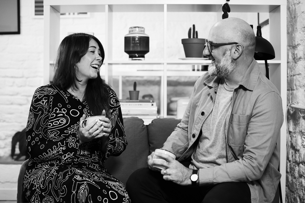
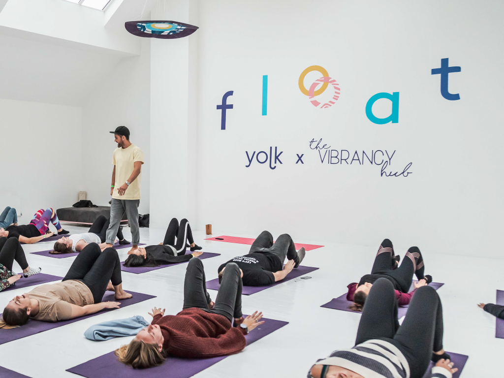
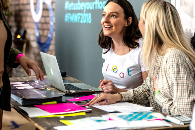
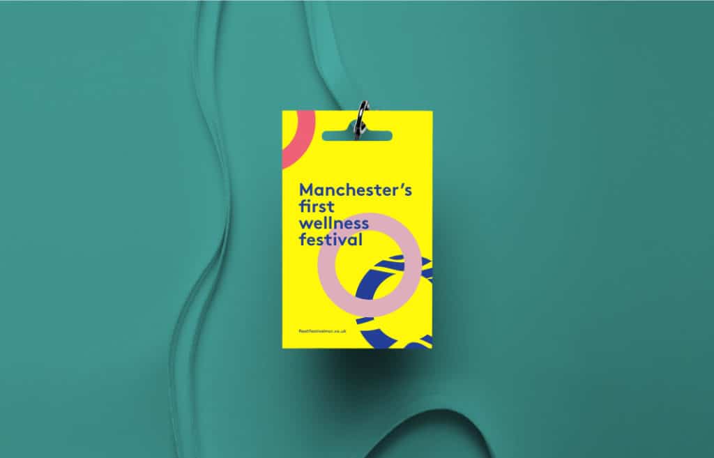
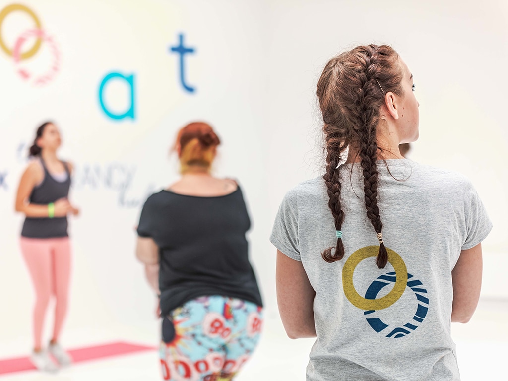
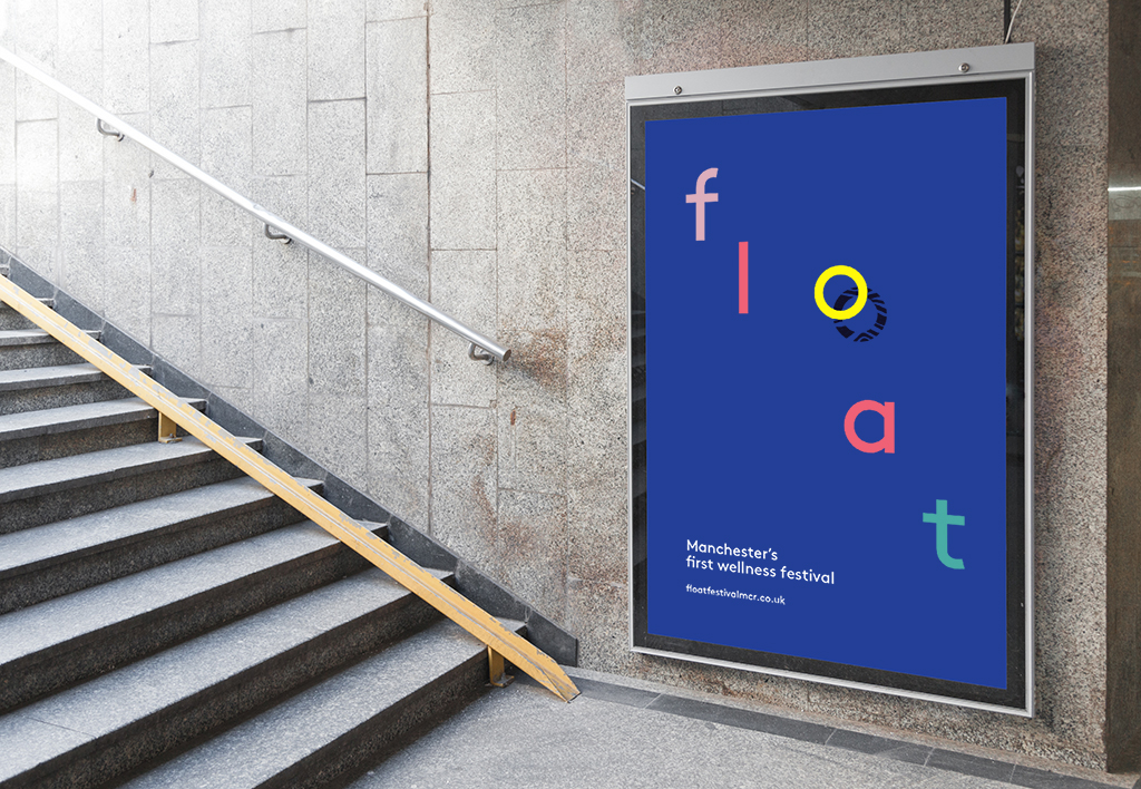
Float is Manchester’s first wellness festival which brings together makers, food brands and mindfulness/yoga teachers, believing that making and creating are as much of a path to wellness as diet and exercise.
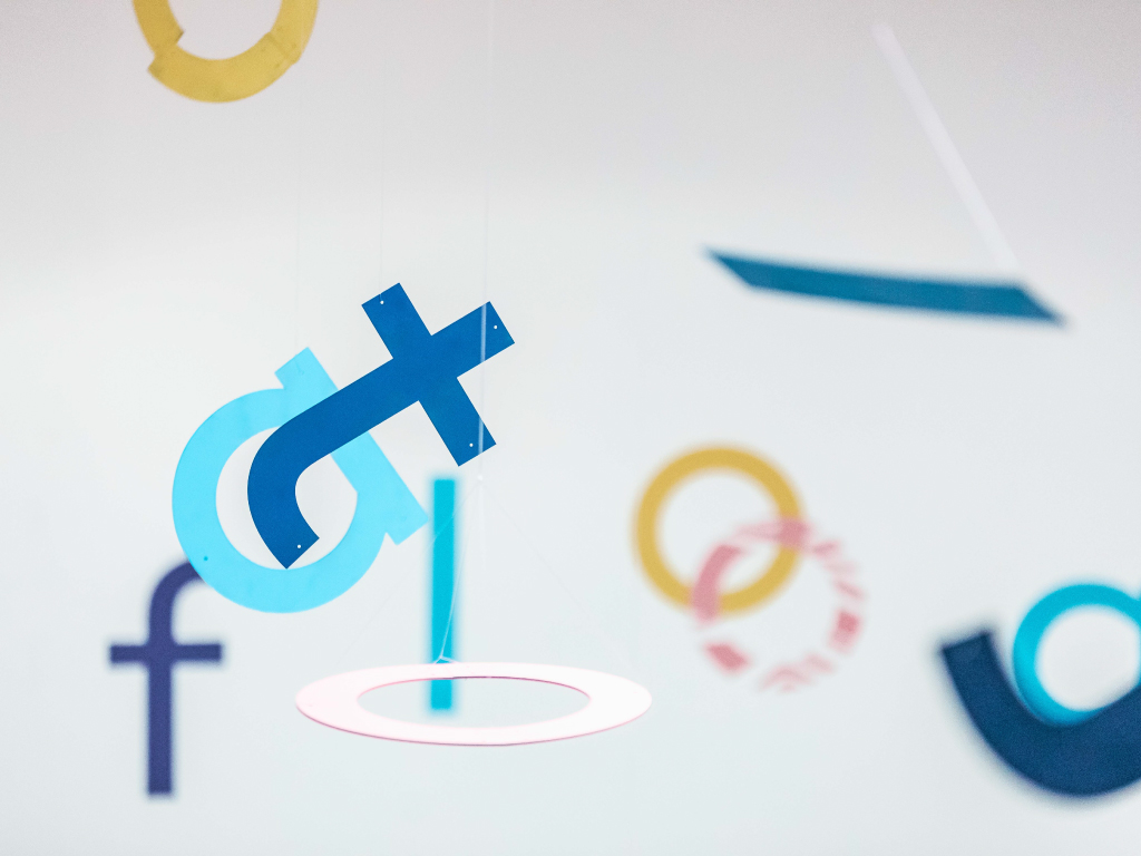
We wanted to create the idea of movement and floating in the logotype, the misplaced positions of the letters add a fun and friendly feel, as well as the use of the different bold colours.
The ‘O’ acts as a life saver icon using a subtle shadow underneath as if it’s floating on water, this can be used on its own adding flexibility to the brand identity.

- Brand Identity
- Advertising
- Merchandise