
Springfield Training are a proud Yorkshire company delivering a wide range of apprenticeship, commercial and online training throughout the UK.
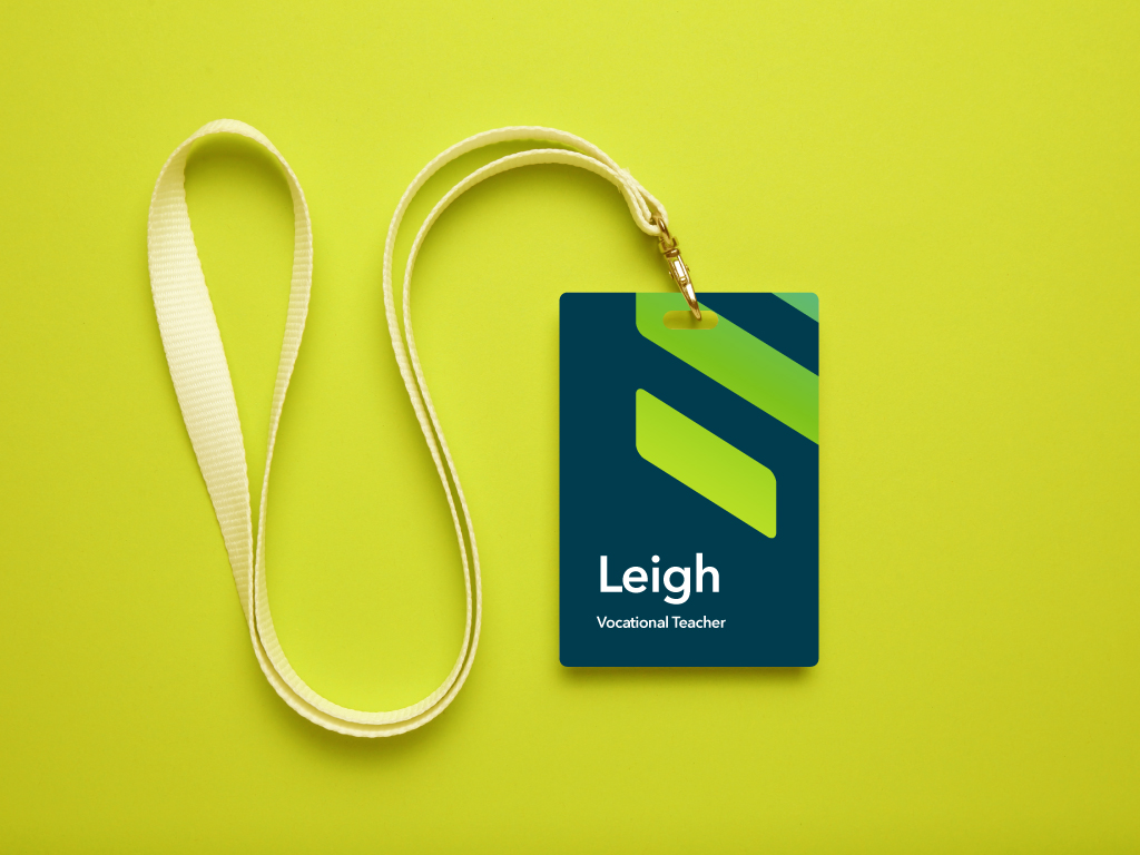
The brand was looking for a cleaner and more approachable design style. Using the ‘S’ from the name we created an icon which illustrates steps going upwards representing the idea of personal growth.
The colours are fresh and contemporary to attract a younger audience and the strapline works alongside the idea of the icon, taking steps forward. We think it instantly communicates the brands vision and values and can work across an array of different marketing materials.


“We met Paul and Emily over two years ago and they immediately ‘got us’ understanding what we wanted to achieve, our values, how we wanted to be perceived and importantly, articulating this in our branding. They have since worked on a number of projects including our current logo, certificate templates and a video that aired on local TV throughout 2019.
We wouldn’t consider working with anyone else.”
Noel Johnson
Managing Director


- Brand Identity
- Editorial
- Advertising
- Film