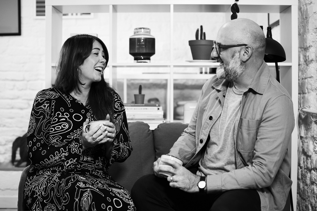
Harrogate Brewing Co. is an award winning, family led microbrewery specialising in traditional brewing of craft ales.
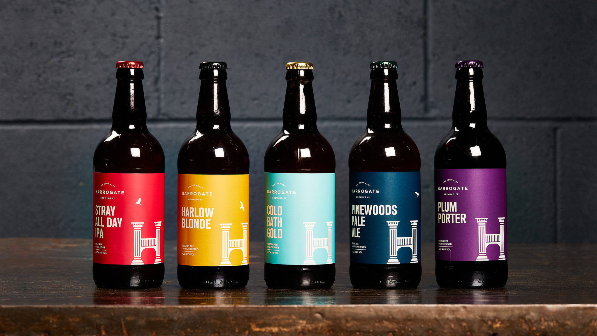
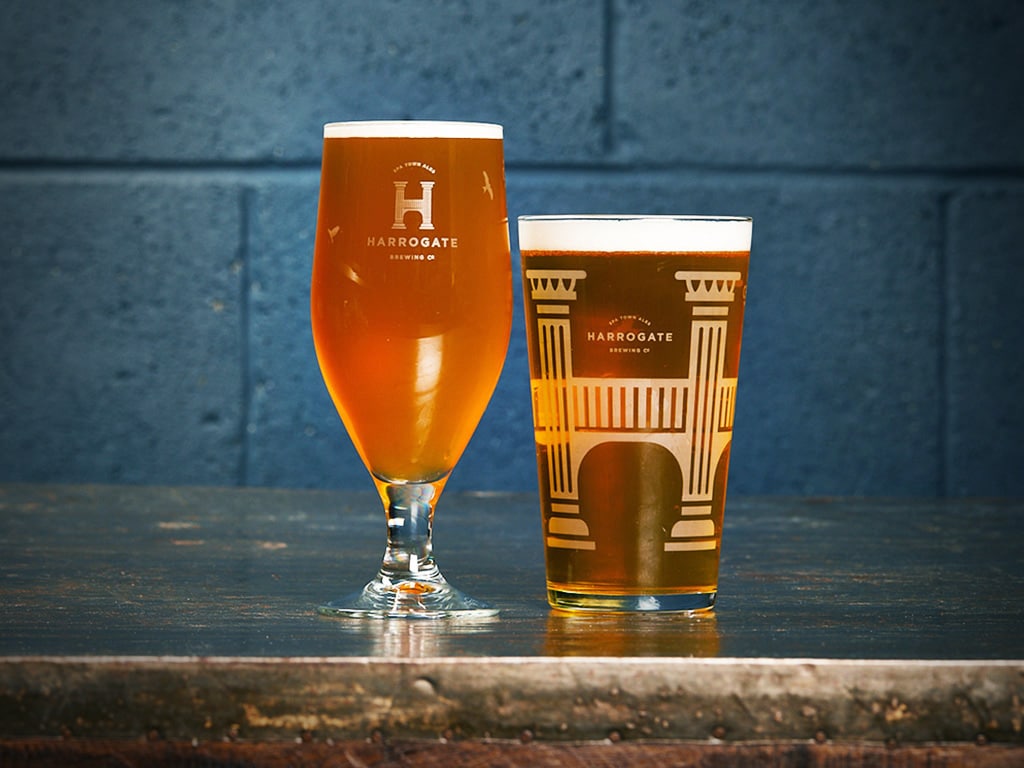
The brewery needed a rebrand to help connect to a wider audience and bring the style more up-to-date to communicate their new vision. The beers pay tribute to the rich history of Harrogate, therefore we created an identity which represents the impressive architecture of the area.
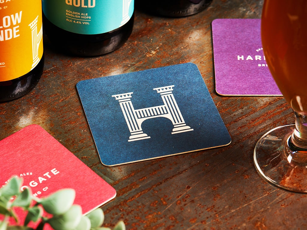
We adapted the original type from the previous logo to help develop the new style and connect to its successful history and loyal regulars.
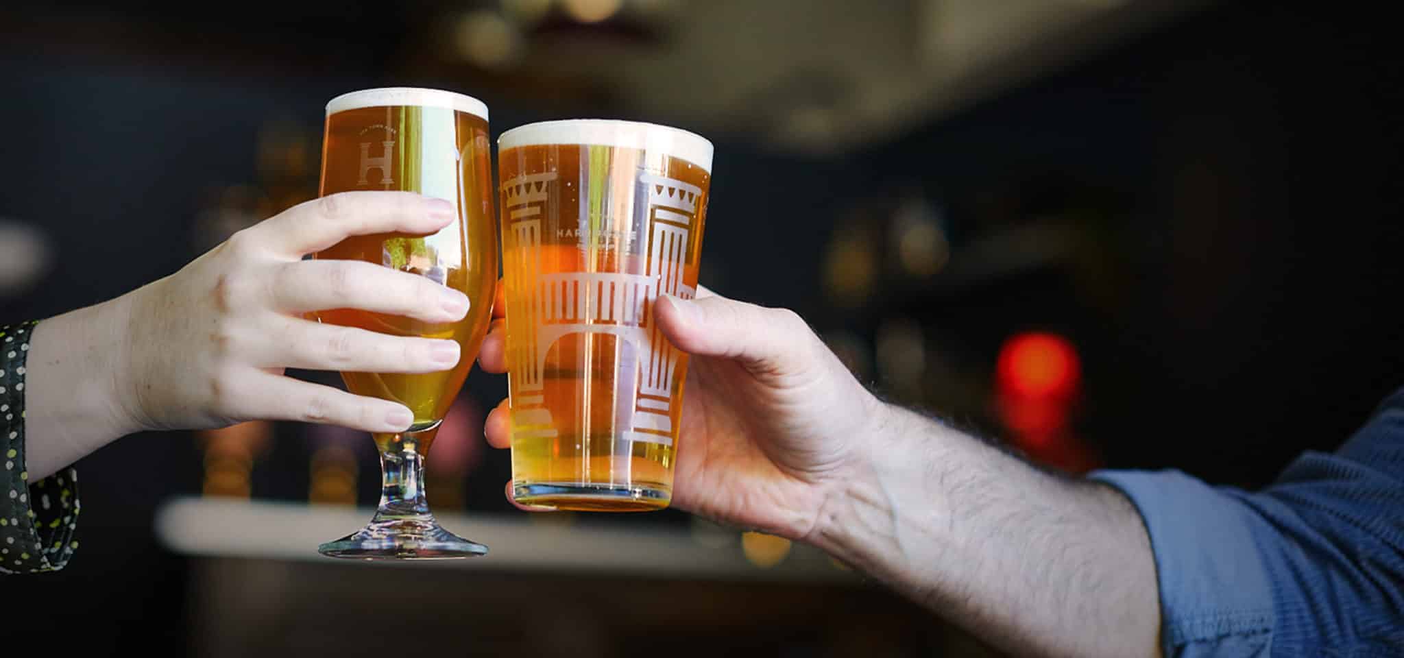
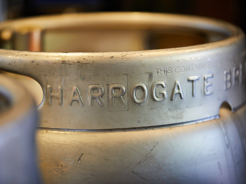
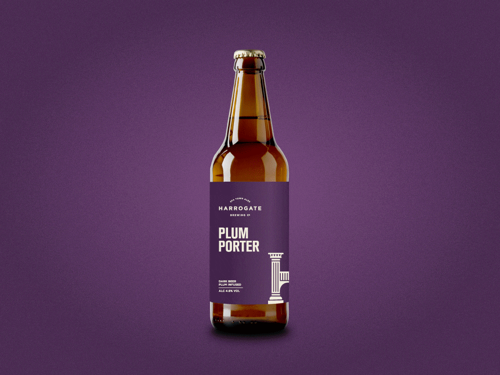
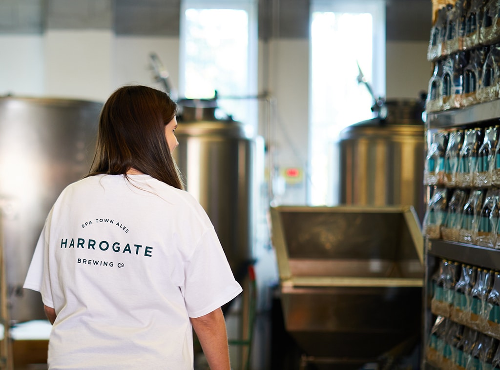
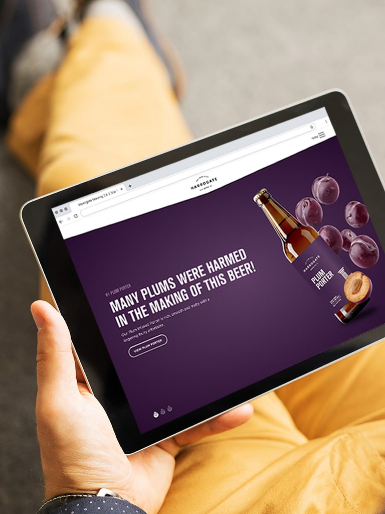
We adapted the new brand across signage, bottle labels, pump clips and merchandise, working closely with our studio friend Built by Mike to create the website.
"Duo created a striking logo that reflected the architecture of Harrogate, they also introduced a Red Kite, which is synonymous with area. The colour scheme was vibrant and engaging, everything came together creating a really strong look for Harrogate Brewing Co. - exactly what we wanted.
The website was essential for us to get right as a significant number of our customers don’t use social media and would access information directly through it. 'Built by Mike' did an amazing job creating an engaging, easy to navigate website that integrated the colour scheme and tone of the brand."
Martha Joyce
Marketing Manager

- Brand Identity
- Illustration
- Packaging
- Merchandise
- Photography
- Website Art Direction